Realism
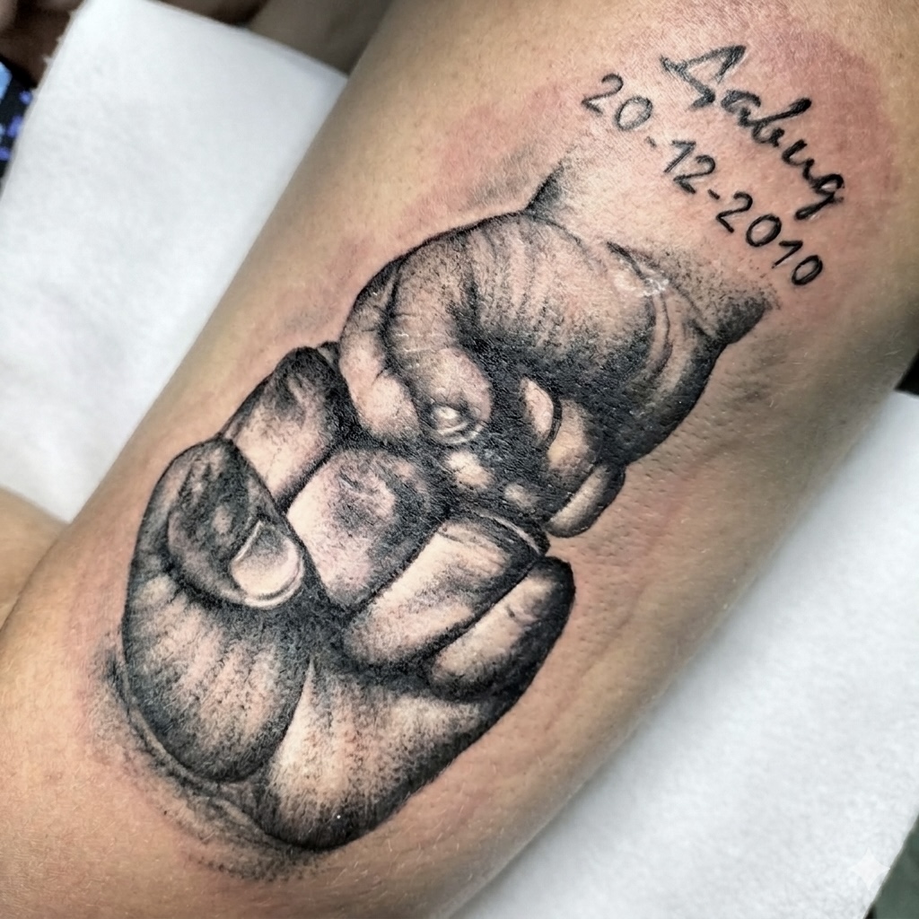
I kept the clasped hands in the centre of this one. The handwriting and the date sit around them, smaller and quieter, so they don't pull your eye off the hands. The light-to-dark shading gives the hands enough depth to read clearly on the forearm, while the softer edges stop the piece becoming a heavy black block.
Handwriting needs particular care. I can clean a reference up enough to tattoo it. But I don't want to polish away the small crooked marks. That's what makes it that person's handwriting and not a font. A date needs more room than it looks like on a phone screen. For a memorial tattoo like this, I ask for the clearest original scan or photograph available, the exact spelling and date, and the body area. I check all of that before the drawing starts because a correction after tattooing is not a sensible option. The photograph shows the fresh tattoo immediately after the session, not a healed result.


